Business / Wanderings 2026
Correlation
Iceland’s population and US healthcare spending per person moved together with a correlation of 0.98. The impressive number is also useless.
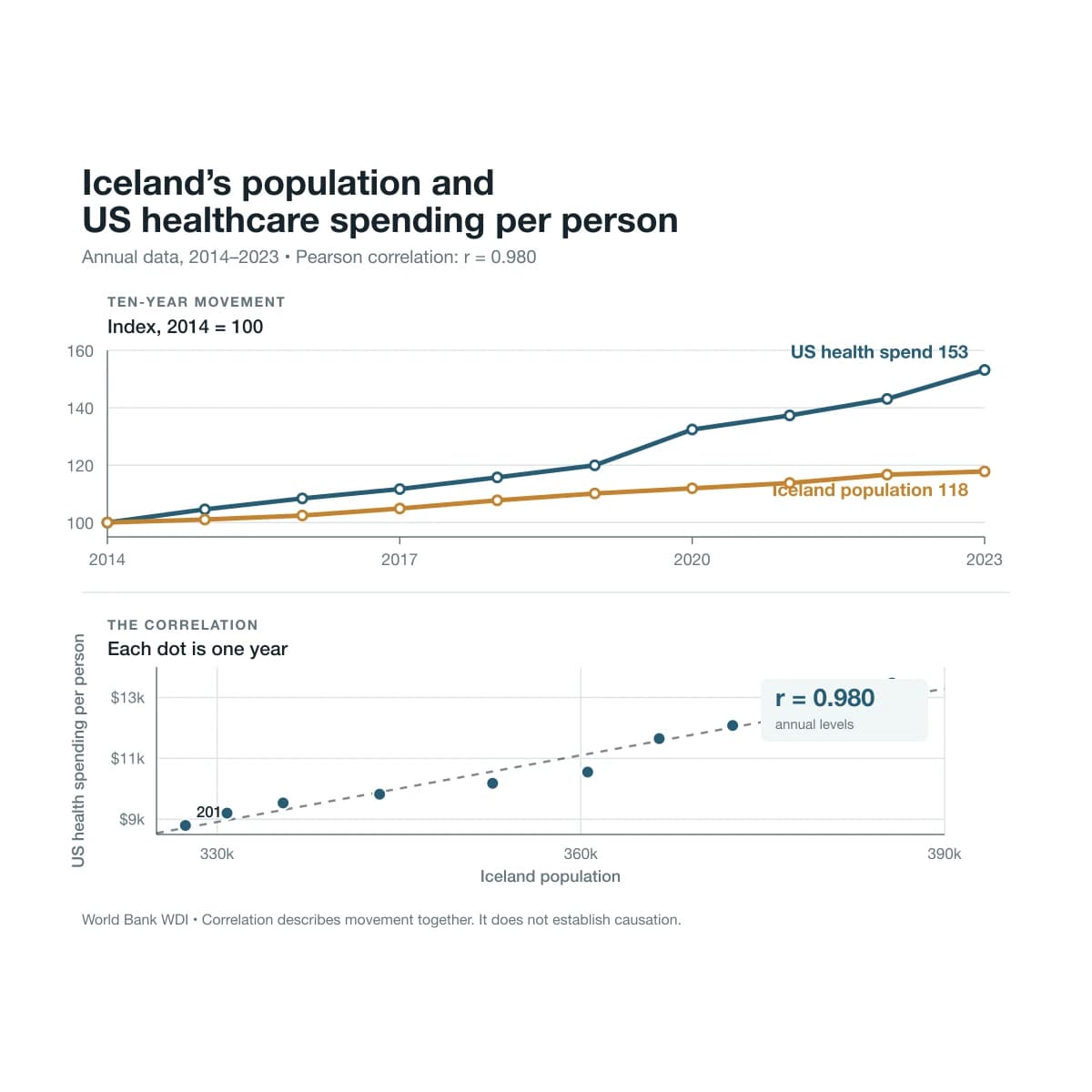
From 2014 to 2023, Iceland’s population rose from 327,386 to 385,663. During the same period, healthcare spending per person in the United States climbed from $8,796 to $13,473.
The Pearson correlation between the two annual series is 0.980. The number looks close to perfect and tells us almost nothing useful.
Iceland does not set American hospital prices. There is no evidence that moving to Reykjavík causes somebody in Ohio to receive a larger medical bill. Still, with a good chart and insufficient conscience, I could give a very confident presentation about it.
The chart above shows the relationship in two ways. The lines on the left are indexed to 100 in 2014, which lets us compare their movement without putting people and dollars on one deceptive axis. The dots on the right show the raw relationship. Ten years. Ten points. A lovely diagonal.
Pearson’s correlation coefficient does one job. It measures how closely two variables move together on a straight line. It does not know what the variables mean. It has never visited Iceland. It has never tried to understand an American medical invoice, which puts it in rather good company.
When we compare the year-to-year changes instead of the annual levels, the correlation falls from 0.980 to -0.327. Iceland’s annual population change and America’s annual healthcare-spending change do not track one another. The impressive number came from two rising lines sharing the same decade.
The underlying figures come from the World Bank’s series for US current healthcare expenditure per person and Iceland’s population. The spending figure is in current dollars, so inflation and rising medical prices help push it upwards. Iceland’s population rose for its own demographic and economic reasons. Time did the matchmaking.
A small factory for ridiculous evidence
Once I started looking, the database became rather generous.
Using ten annual observations from the World Bank’s World Development Indicators, I found these relationships:
- India’s urban population share and France’s population aged 65 and over had a correlation of 0.999 from 2015 to 2024.
- Global aquaculture output and the estimated global population aged 65 and over came in at 0.998.
- Brazil’s forest-area share and German fixed-broadband subscriptions per 100 people produced -0.997 from 2014 to 2023. More German broadband, less Brazilian forest. Please do not build environmental policy around this sentence.
- US commercial-bank branches per 100,000 adults and the US population aged 65 and over produced -0.993.
- The World Bank series called secure Internet servers, which counts publicly trusted TLS and SSL certificates rather than physical machines, correlated with the US birth rate at -0.969. More certificates, fewer babies. Silicon Valley will have a theory by lunch.
These are Pearson correlations of published annual levels downloaded on 6 August 2026. I did not add any interpolation. The source series are less pristine than the decimals suggest: the Indian and French demographic data include UN estimates and smoothing, Brazil’s annual forest figures can reflect estimation between periodic assessments, and Germany’s broadband figure counts subscriptions rather than individual people.
The bank-branch example is particularly good. When I compared the annual changes, its correlation went from -0.993 to 0.014. The relationship disappeared. One line declined smoothly while another rose smoothly, and Pearson rewarded their commitment to the plot.
These examples are amusing because nobody has supplied a believable mechanism. Their statistical strength makes them dangerous because the numbers look more serious than the reasoning.
Ask enough questions and the database will say yes
Data dredging means searching through many combinations and presenting the winner as if it were the original hypothesis.
Exploration is useful. It is how we notice patterns and form better questions. The trouble begins when we hide the search process. A result found after testing thousands of ideas carries different evidence from a result predicted in advance and confirmed on untouched data.
Imagine testing 1,000 unrelated relationships and using a 5% significance threshold. Even if every relationship is noise, you should expect about 50 apparently significant results by chance. Publish the funniest five and forget the other 995, and the reader sees a small miracle instead of a large search.
The World Bank Indicators API offers nearly 16,000 time-series indicators. That gives us roughly 128 million possible indicator pairs before adding countries, different date windows, time lags, currencies, per-person adjustments or growth rates.
Somewhere inside that pile, Luxembourg’s cheese imports will explain a stock market. Give me another afternoon and perhaps it will predict the weather in Akureyri.
Conventional statistical tests assume that the hypothesis and method were fixed before the result arrived. A large hidden search breaks that assumption. Corrections such as Bonferroni or false-discovery-rate controls can account for multiple tests, but the more useful habit is intellectual hygiene: say which analysis was exploratory, keep a separate confirmation sample and report how many relationships you tested.
Time is hiding inside the chart
Shared macro trends create much of this nonsense.
Across a decade, populations grow, societies age, nominal spending rises, broadband spreads, certificate counts explode and physical bank branches close. Two variables can follow the same clock without affecting each other.
Smooth annual series make the illusion stronger. This year’s population is closely related to last year’s population. This year’s spending inherits much of last year’s spending. Ten annual points therefore do not behave like ten independent experiments. Statisticians call this autocorrelation. Plain English works too: the data has a memory.
Units can add another layer of confusion. Current dollars rise partly because prices rise. Totals rise when populations rise. A rate per 100,000 adults may fall while the absolute population in another series grows. Put the wrong denominator beside the wrong total and the chart starts writing its own fiction.
The first repair is to remove the trend. Compare annual changes, calculate growth rates or estimate each variable’s trend over time and compare what remains. Use inflation-adjusted values when purchasing power matters. Use per-person measures when population scale is driving the result. Then check whether the relationship survives a different period.
Our Iceland-America correlation fails this basic test. The annual changes point weakly in opposite directions. The 0.980 headline has lost its job.
Some strange relationships have a mechanism
We should not dismiss every surprising correlation. A strange result can become useful when mechanism, timing and evidence line up.
Researchers analysing 114,417 Major League Baseball games found that a 1°C increase in the daily high temperature was associated with 1.96% more home runs in open-air games. Warm air is less dense, so the ball meets less drag. Climate models attributed 577 home runs from 2010 to 2019 to historical warming. That was a small part of the wider home-run boom, but the physics makes sense and the effect appears in individual batted-ball data too.
In three German chess tournaments, a 10 microgram per cubic metre increase in indoor PM2.5 raised the probability of a meaningful error by 2.1 percentage points, a 26.3% relative increase from the study’s baseline. The penalty grew near the time control. Air pollution can affect cognition through inflammation and oxidative stress. The main sample came from one venue and included players from novices to FIDE masters, so office managers should resist turning the result into a new dashboard.
Deer-vehicle collisions rose 16% during the seven days after the autumn clock change. The switch moves evening traffic into darkness during the deer rut. The timing and animal behaviour provide a mechanism. The larger claim that permanent daylight-saving time would prevent 36,550 collisions per year came from a model, not a national policy experiment.
Another study examined roughly four billion geolocated tweets from 773 US cities. Compared with days whose maximum temperature was 15°C to 18°C, hate-tweet counts were 22% higher at 42°C to 45°C and 12.5% higher at -6°C to -3°C. Thermal stress may increase aggression, although a machine-classified tweet from a self-selected Twitter user is a long way from a universal law of human behaviour.
These studies do more than place two rising annual lines beside each other. They examine timing, individual events, alternative explanations and a mechanism that can be challenged. The remaining caveats stay visible.
Six questions for the next beautiful chart
Before trusting a correlation, I now ask:
- Did the hypothesis exist before somebody saw the result?
- How many other relationships were tested and discarded?
- Are both variables following time, inflation, population or technological adoption?
- Does the relationship survive annual changes, growth rates or detrending?
- Is there a believable mechanism with the right timing?
- Does it replicate in new data that was not used to find it?
The questions take less time than recovering from a confident decision built on nonsense.
Keep the Iceland-America chart as a warning. Before trusting the next beautiful relationship, ask the six questions above. And please do not send Reykjavík the American healthcare bill.